Pictograms
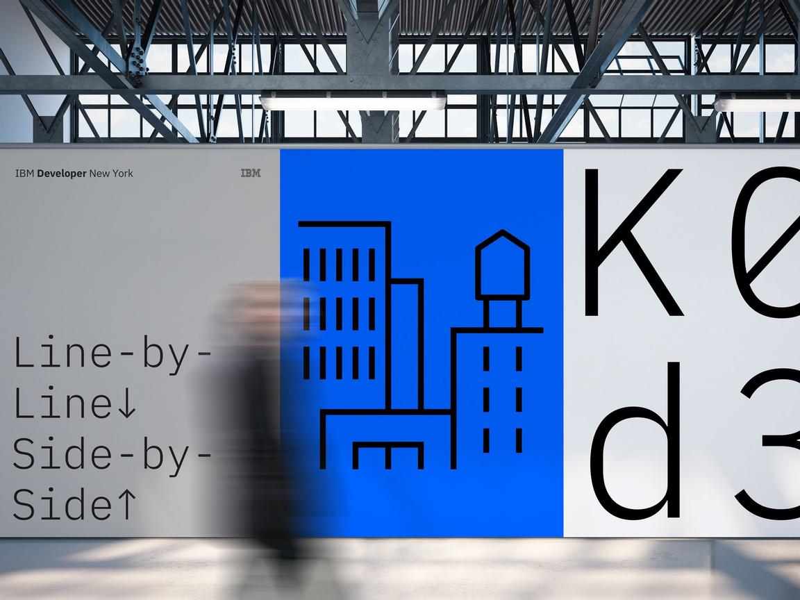
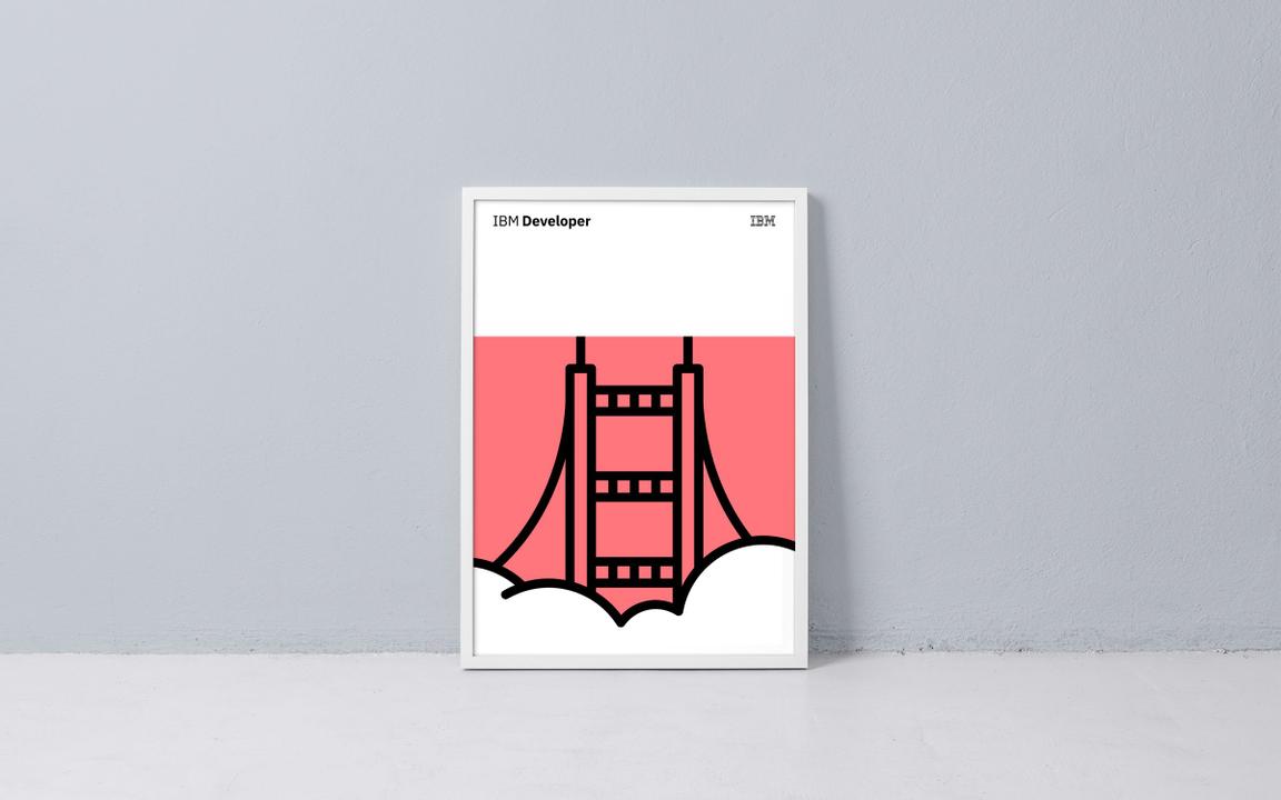
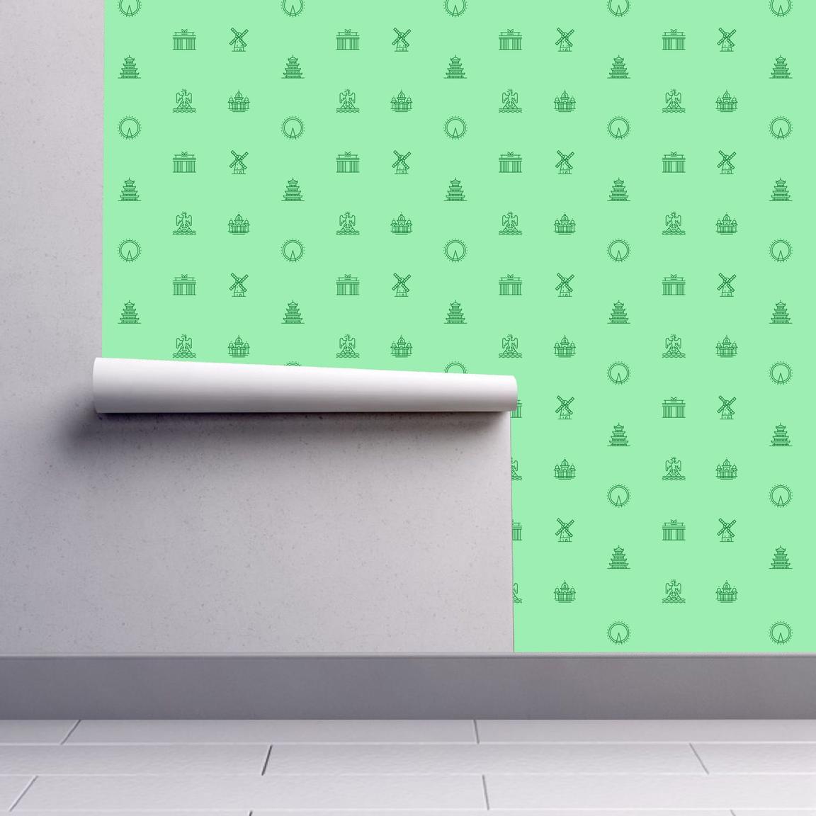
IBM’s pictograms are visual symbols used to represent ideas, objects, or narratives. They can communicate messages at a glance, afford interactivity, and simplify complex ideas. They draw from details found in the Plex typeface and work well in presentations and marketing communications.
Usage
Pictograms are illustrative and expressive and can live within a wide variety of scales and environments whether digital or physical. As they are built on the same grid as the rest of the IBM icon family, they share many of the same basic principles but allow for more visual complexity and communication. You may use pictograms to enhance the information you are conveying across various media. It’s important to use pictograms sparingly but effectively throughout your design.
Do treat pictograms as illustrations and provide proper clearance
Don’t use pictograms as a replacement for UI icons, that is not their purpose.
Don’t use any pictogram as a logo or in a lockup for product headers, merchandise or events.
Sizing
Pictograms are used in a range of sizes, the minimum being 48px while the maximum size may vary based on application. Use pictograms at their original sizes or scale at accepted increments. You may need to adjust the stroke weight accordingly to accommodate larger scales. For more information on scaling and accessibility, see the section on mini units on the 2X Grid page.
| Icon size | Stroke width | Padding | Live area | Corner Radius |
|---|---|---|---|---|
| 48px | 1.08px | 1.5px | 48px | 3px |
| 64px | 1.44px | 2px | 64px | 4px |
| 80px | 1.80px | 2.5px | 80px | 5px |
| 96px | 2.16px | 3px | 96px | 6px |
| 112px | 2.52px | 3.5px | 112px | 7px |
There is no set maximum to pictogram sizes. As you scale pictograms to larger sizes you may want to alter stroke weight to accommodate accessibility or environmental factors.
Alignment
Pictograms are optically aligned to the center of the icon grid within the boundary box. Centering ensures all pictograms will be aligned correctly when exported and used side by side.
Containers
Pictograms can be represented in a circular or rectangular container calculated based on the padding size.
Do follow the clearance rule to allow for legibility and touch.
Don't collapse the pictogram clearance area.
Do use accepted shapes: circle or square for containers.
Don’t create new shapes for containers.
Do always optically center align pictograms in their containers.
Don’t crop pictograms in container.
Clearance
When designing with pictograms, all artwork should include minimum padding based on 1/4 of the scaled grid size. The padding can be increased by increments of 1/4 grid units.
Padding starts at the edge of the container shape.
Padding is the same for both circle and square containers.
Same spacing rules apply when using pictograms without containers.
Do keep pictograms at scale and optically center in container when necessary.
Don’t resize pictograms outside of accepted proportions.
Pictograms in action


